How to Make a Good CV for Work Experience Opportunities
Get the crucial hands-on introduction to working life. Learn how to write a CV for work experience that opens doors and launches your career in style.
Our customers were hired by:
When you’re applying for a job there’s no doubt you’ll give careful consideration to your work experience, skills and education. Many candidates spend hours crafting each sentence to perfection.
But there’s one process that many people overlook completely. CV design. That’s not to say you can just have a slick looking CV and leave the rest to chance. But use the best CV design combined with top-notch content and you’ll have a CV that’ll win you more interviews than you ever thought possible.
This guide will show you 12 outstanding design CV examples plus give you tips on how to implement high-quality CV template design yourself.
Create an effective CV in minutes. Choose a professional CV template and fill in every section of your CV in a flash using ready-made content and expert tips.
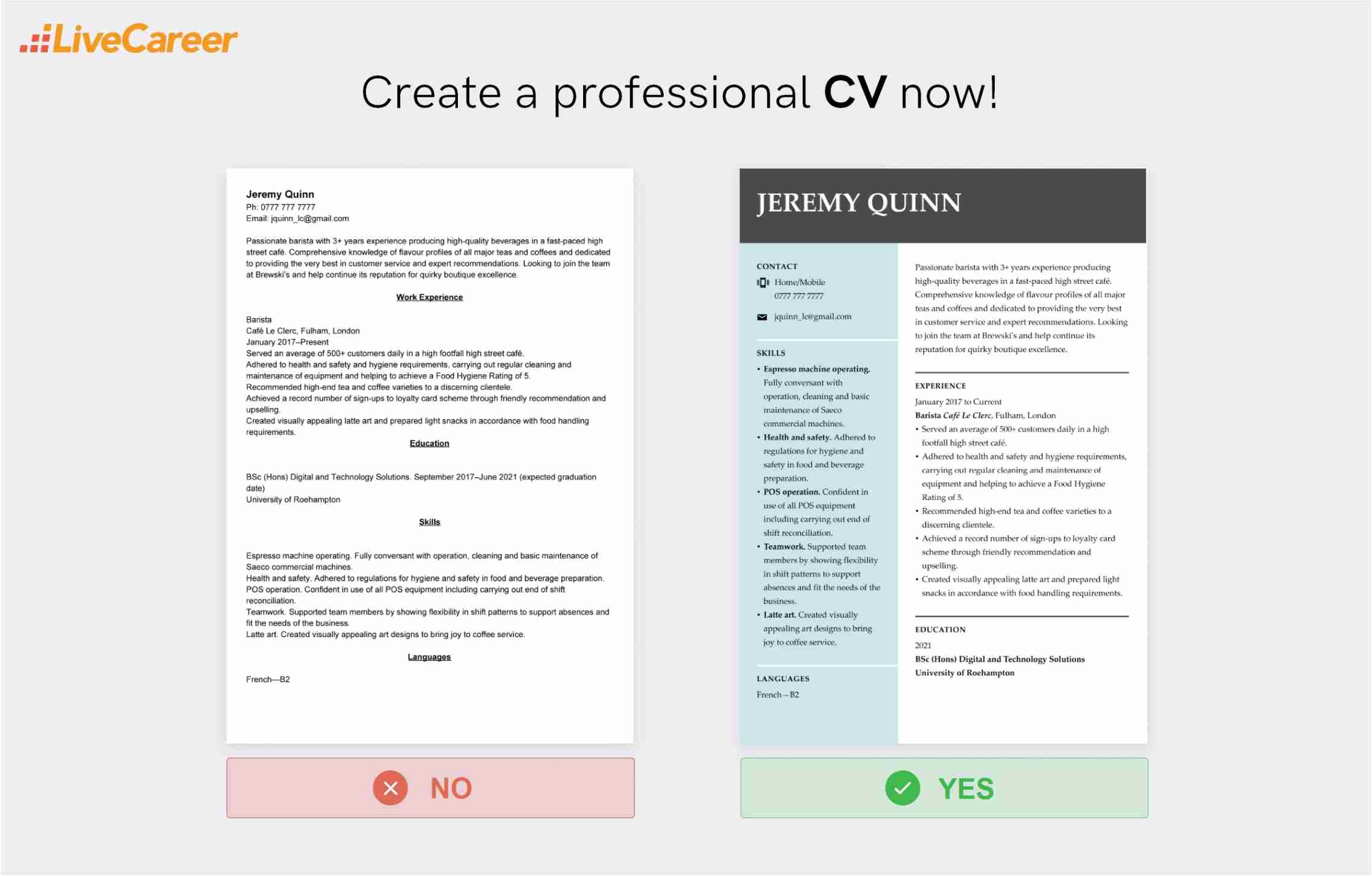
We created the sample on the right using our builder. See other good CV examples like this one.
Want to use different type of CV template? Check these guides:
Jeremy Quinn
Ph: 0777 777 7777
Email: jquinn_lc@gmail.com
Passionate barista with 3+ years experience producing high-quality beverages in a fast-paced high street café. Comprehensive knowledge of flavour profiles of all major teas and coffees and dedicated to providing the very best in customer service and expert recommendations. Looking to join the team at Brewski’s and help continue its reputation for quirky boutique excellence.
Work Experience
Barista
Café Le Clerc, Fulham, London
January 2017–Present
Education
BSc (Hons) Digital and Technology Solutions. September 2017–June 2021 (expected graduation date)
University of Roehampton
Skills
Languages
Here are the best CV designs:
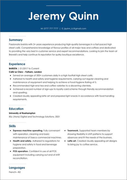
This example has a particularly striking CV design element in the form of a wide blue CV header, featuring the candidate’s name and personal details in bright white font. When you’re applying for a job, you’re effectively marketing yourself as a product. And this example does a brilliant job of doing exactly that. On that note, we’d recommend it as the perfect choice for a marketing CV.
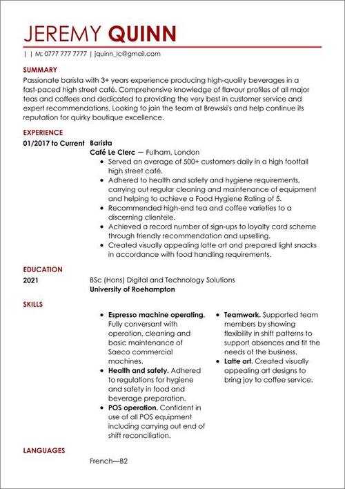
Now for a CV design that uses an elegant dark red to give a colourful touch of class. The coloured header is then reflected in the font for the CV summary and other section headings. Interestingly, the colour red increases the appetite, so we’d recommend it for industries related to food. Perfect for a chef CV.
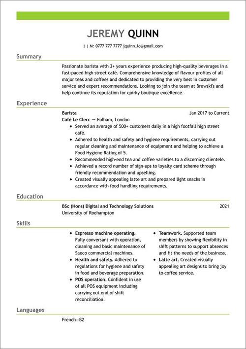
Here we have a fresh green CV design template. Making your CV stand out can be as simple as adding a couple of very basic design elements in the form of those green stripes. It also tweaks the CV fonts slightly and contrasts grey on black. See how the work experience section for example has a grey header but black body text. And green is all about youth and freshness, so we’d recommend it as an excellent choice for a student CV.
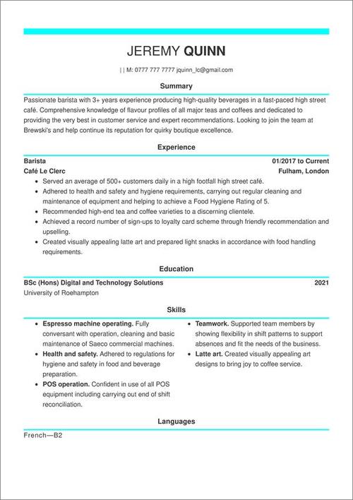
Now for a similar design CV trick but this time with bright, electric blue accents. Those lines of colour help give a neat sense of separation to the overall CV design. That neatly defines each section of the CV helping to make sure everything gets taken into consideration, all the way down to the CV education section. It has exactly the sort of understated class that would look great on a designer CV.
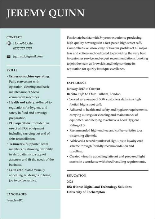
This is a particularly creative CV design with its use of a trio of background colours. Dark grey, duck egg blue and white all perfectly complementing each other to give a look that’s both creative and professional. And moving the CV skills section to the left-hand column gives more room in the main body for additional sections, such as hobbies and interests. A superb choice for a graphic designer CV.
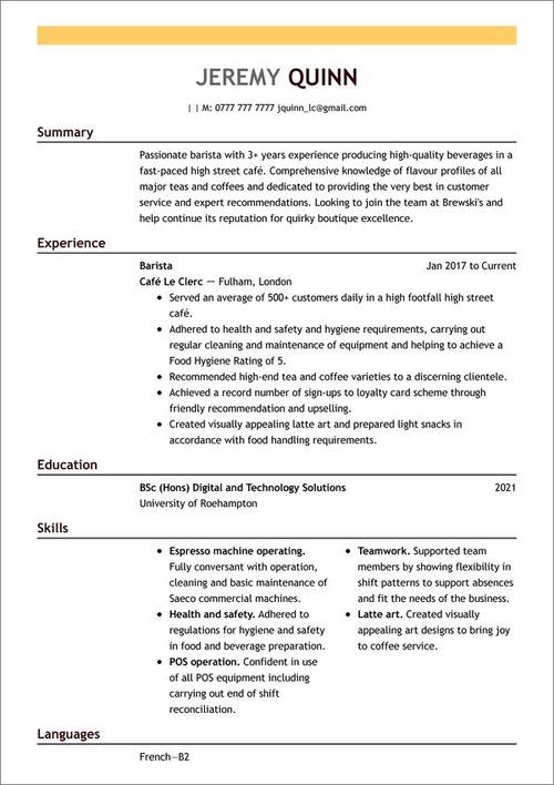
Now for a warmer feel with a comforting splash of orange. Note the generous CV layout which gives plenty of room to create a one-page CV. But it certainly doesn’t feel cramped. The generous use of white space adds emphasis and makes each section stand out. That’s vital because ease of reading is crucial for hiring managers who have to quickly assess multiple candidates for each role. We think the warm tone of this template would make it a perfect example for a customer service CV.
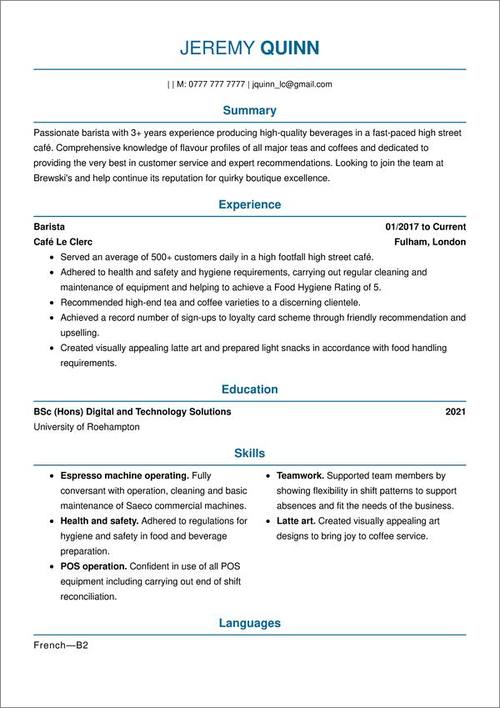
Some of the best CV design is subtle. This example takes a classic CV format and adds blue header fonts and lines. It’s a simple tweak but one that adds an element of understated class. Perfect for jobs with corporate clout and an excellent choice for a business analyst CV.
A strong CV summary will convince the recruiter you’re the perfect candidate. Save time and choose a ready-made personal statement written by career experts and adjust it to your needs in the LiveCareer CV builder.
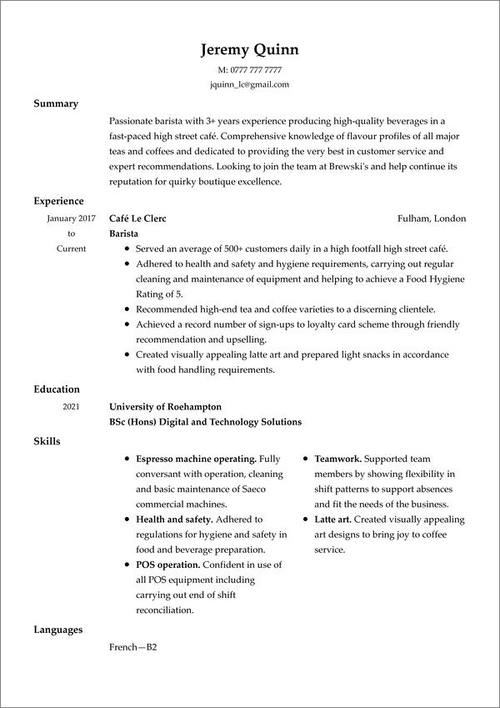
Our next few templates are more traditional, but minimalist CV design can be just as effective. Here we have simple black text on a white background but plenty of design elements to enhance its utility. Using centre alignment for the CV header instantly makes the candidate’s name and contact details stand out. Then a careful mix of alignments and margins for the remaining CV sections makes it easy to quickly scan. Just right for a teacher CV.
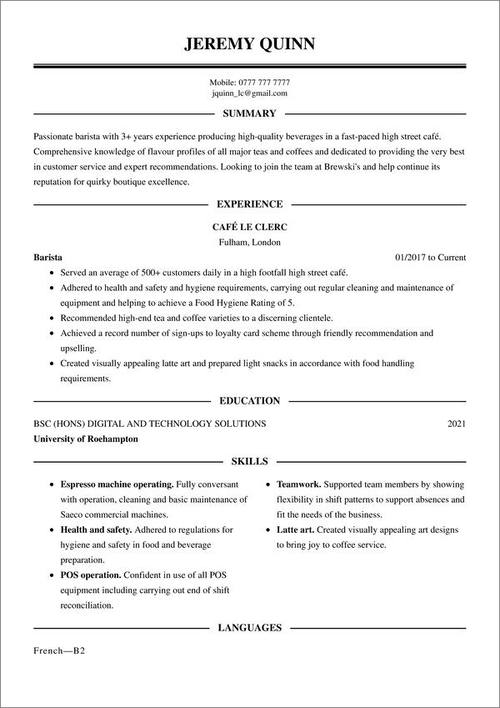
A personal favourite, the name explains it all with this one. This CV template design has been crafted to evoke a classic corporate business card. The capitalised headings and serif font add to the overall sense of style. Having a two-column format for the skills section is another smart move that gives you more room to expand on your job-winning abilities. Perfect if you’ve got lots of transferable skills to showcase. We’d recommend giving it a try for a project manager CV.
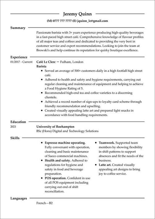
This template proves that even the most simple CV design can be attractive and effective. Simple lines separating the sections and an effective CV structure help the reader locate and isolate important information. There’s nothing worse on a CV than a single uninterrupted block of text and this example solves that problem well. With such a neat framework it’s an obvious choice for an engineering CV.
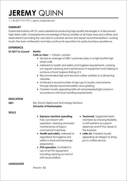
This example uses simple CV design ideas to give a striking first impression. The mix of bold and standard weigh font in the CV header really makes the candidate’s name leap off the page and the full-width CV summary gives plenty of room for an eye-catching introduction. A solid pick for a marketing CV.
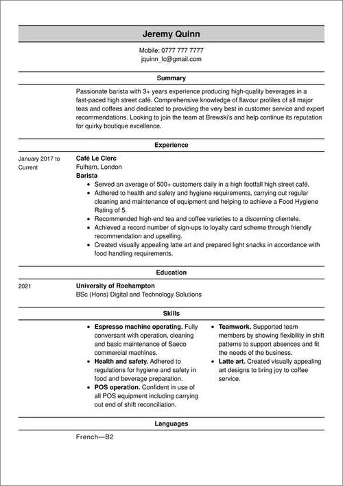
The concept for this CV design template is simple. It creates a compact layout that lets you easily create a one-page CV without sacrificing readability. The CV header has been shrunk and neatly placed on top of the page and the grey shading ensures your name won’t be missed. Superb for those just starting out in their career and our pick for a graduate CV.
You’ve just seen some fantastic CV template designs. Now we’re going to look at the factors we considered to create these professional CV designs. Keep them in mind for creating your own CV design.
Choosing the right CV format is the first step to producing a good CV design. We recommend you stick to the chronological CV format. It’s the gold standard in recruiting and it puts the emphasis exactly where it should be, on your work history.
Make sure your CV sections are in the right order. Here's what should a CV look like in terms of CV structure:
And if you’ve got less experience, your education section can go before your work history. Worth bearing in mind if you’re writing a school-leaver CV.
An attractively presented page layout makes your CV more likely to be read. Use one-inch margins on each side of the page. Choose an attractive CV font set to 11 or 12, classics like Arial, Helvetica and Times New Roman are perfect. Then set your spacing to 1.15 and leave a double space between each CV section.
You can also tweak your font styles to add emphasis. Use bolding and italics to highlight important information and consider making section headings 4–6 points larger than the body text to make them stand out.
These help to break your text down into manageable chunks. As I mentioned previously, dense walls of text do not work well in a CV. Bullet points are particularly useful in your work experience section. Include up to six bullet points for each job, starting them off with CV action verbs to make them even more impactful.
Hiring managers are busy people, they don’t have time to read through multiple page CVs. Should you stick to a one-page CV then? Yes, always aim for a one-page CV. The exception is when you’ve got many years of experience and you’re targeting more senior positions. In that case you can stretch to three. And an academic CV can stretch even further, but for most candidates 1–2 pages is fine.
As you’ve seen, the simple addition of a little colour can really help your CV design stand out. But take care, colour psychology has shown that colours influence our perception. For example, using bright pink for a traditional corporate job wouldn’t be advisable, but dark blue would be perfect for your CV.
One of the biggest CV sins is just copy-pasting the same version for every job application. Make sure you write a tightly targetted CV for every role you apply for. Check the job description, note the exact skills and experience it requires and make sure your CV addresses them effectively. Every CV design you create should be unique. You can use free AI CV builders to speed up the whole process.
Many CV template designs you’ll find online include one, but the majority of UK recruiters agree that a CV photo is unacceptable. There are too many risks of discrimination when a candidate’s identity is revealed. And for the same reason, you should never include personal information like your date of birth or marital status.
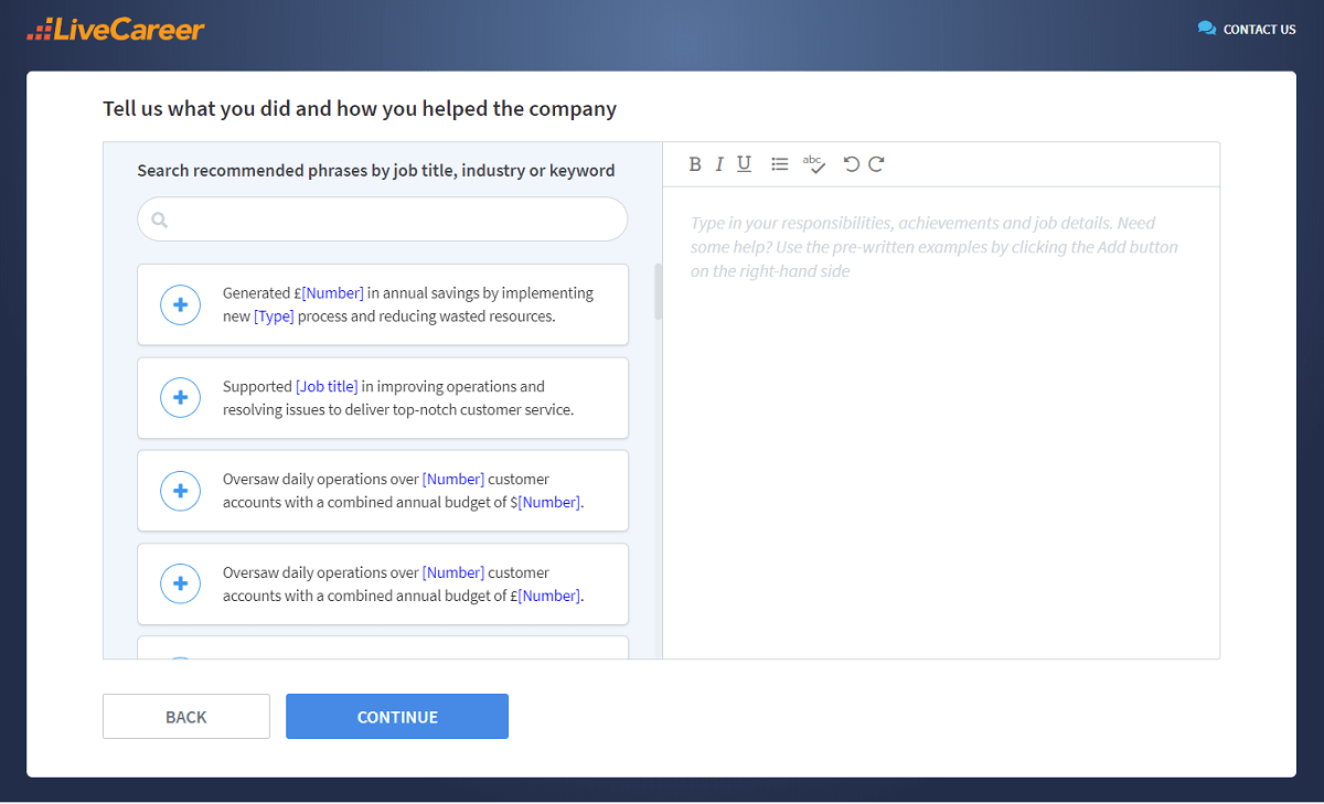
The best way of guaranteeing you have the best CV design is to choose a professionally designed template. Every LiveCareer CV template has been carefully created to be both attractive and recruiter approved.
You don’t have to be a CV writing expert. In the LiveCareer CV builder you’ll find ready-made content for every industry and position, which you can then add with a single click.
And that’s it, you now know all about how to design a CV and choose the best CV template designs. If you have any questions, please use the comments section and I’ll be happy to help.
Our editorial team has reviewed this article for compliance with Livecareer’s editorial guidelines. It’s to ensure that our expert advice and recommendations are consistent across all our career guides and align with current CV and cover letter writing standards and trends. We’re trusted by over 10 million job seekers, supporting them on their way to finding their dream job. Each article is preceded by research and scrutiny to ensure our content responds to current market trends and demand.
About the author
Since 2013, the LiveCareer UK team has shared the best advice to help you advance your career. Experts from our UK editorial team have written more than one hundred guides on how to write the perfect CV or cover letter.
Rate this article:
Cv design
Average:
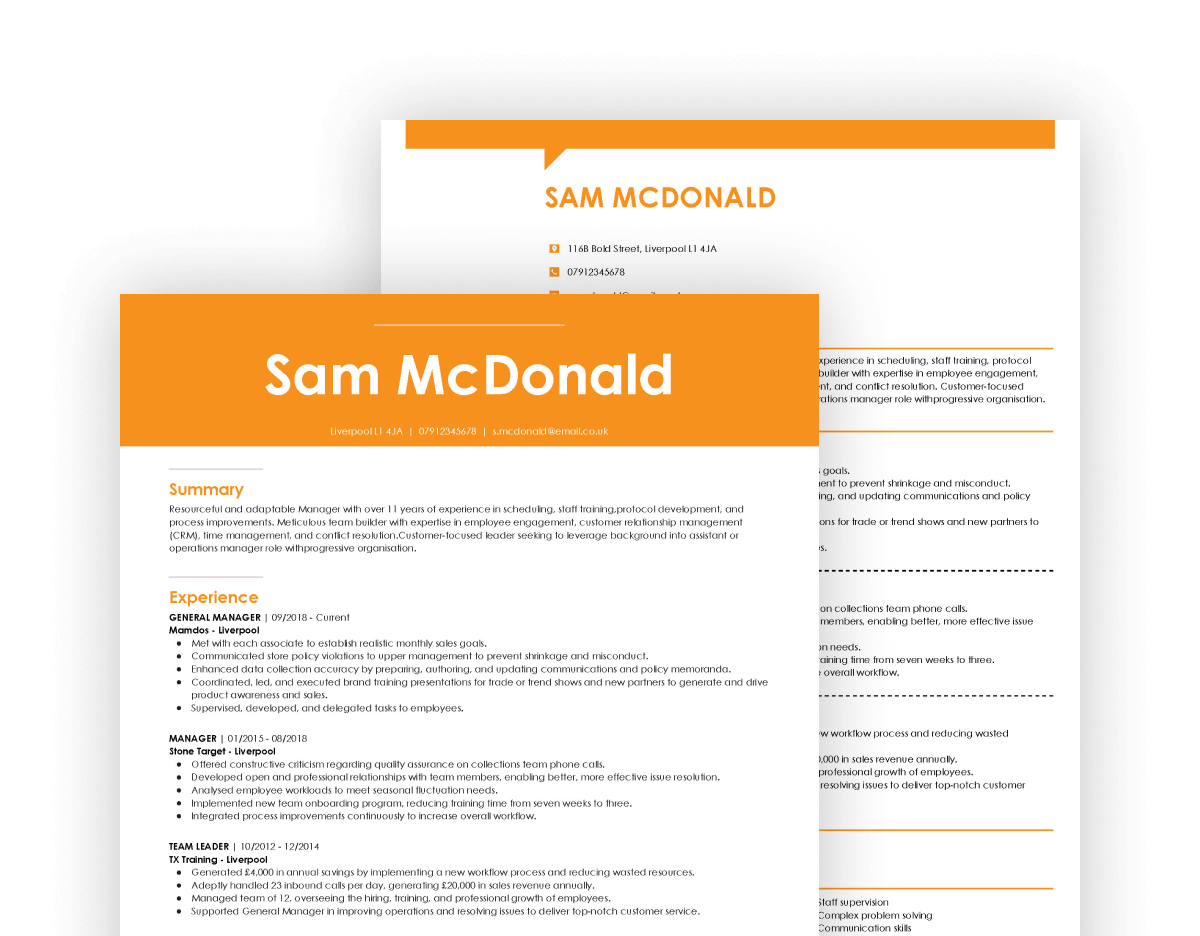
Get the crucial hands-on introduction to working life. Learn how to write a CV for work experience that opens doors and launches your career in style.
See when to use a skills based CV and how to write it for the UK job market. Learn from the free skills based CV examples and download a functional CV template.
Your portfolio is essential, but you won’t get any modelling jobs without an outstanding CV. See how to write a model CV with UK examples and a template.
Our customers were hired by: