Software Developer CV Example, Template & Writing Guide
Whether you're writing a graduate software developer CV, junior software developer CV or senior software developer CV, don't let poor UX let you down!
Our customers were hired by:
You’ve probably given lots of thought to what you should write in your CV but have you given any thought to what should a CV look like? Creating a good impression with a professional looking CV is just as important as having the right skills and experience.
You’re about to learn everything you need to know about how a CV should look like to get you one step closer to landing the job of your dreams. Plus, you'll get actionable tips to make your CV look outstanding and aligned with modern UK standards.
Create an effective CV in minutes. Choose a professional CV template and fill in every section of your CV in a flash using ready-made content and expert tips.
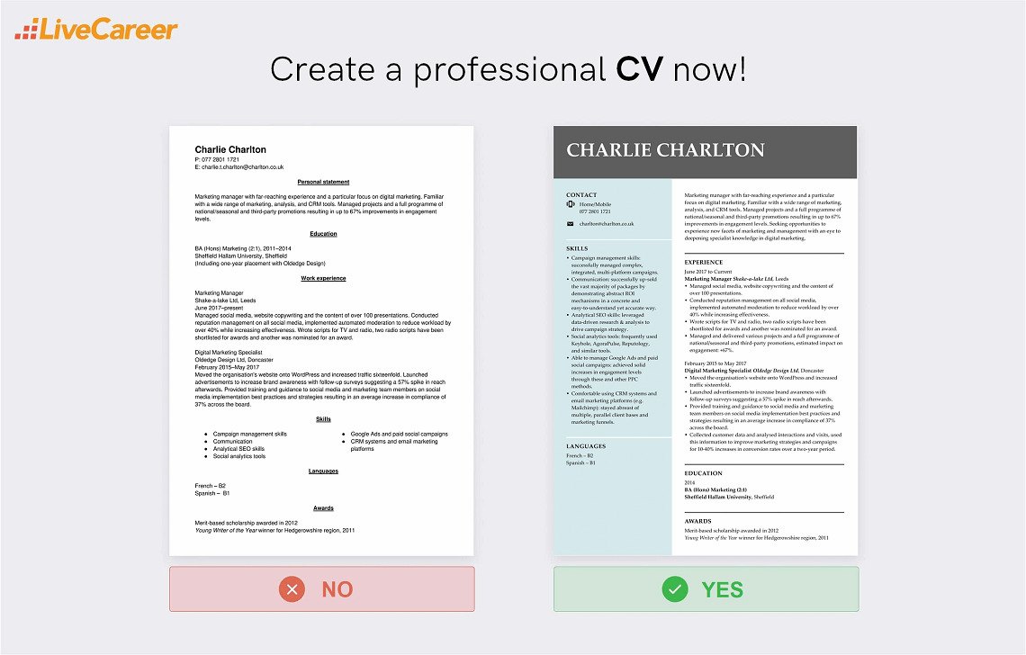
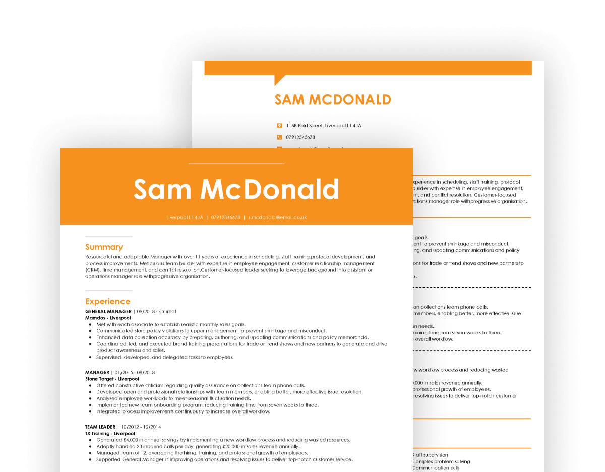
We created the sample on the right using our builder. See other good CV examples like this one.
When writing a CV from scratch, you might need extra help. Check these guides:
Our analysis of 6 million CVs made with our builder reveals that*:
*The data comes from a period of the last 12 months (August 2023-August 2024).
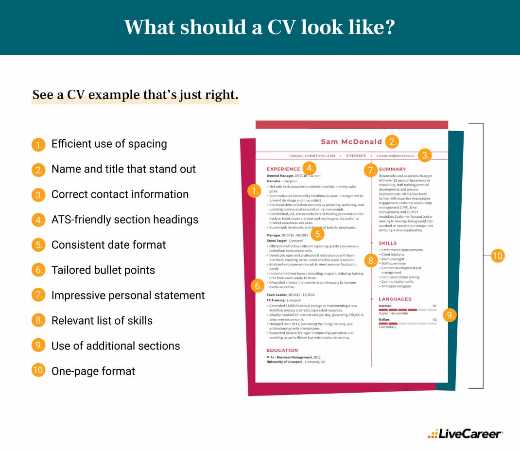
You’ve just seen what a CV should look like. Next, you’ll learn how to do it yourself.
If you're wondering how a CV should look, here's a quick overview. Your first step in creating a good-looking CV is to get the setup right. A good CV is concise, and it's one page maximum unless it's an academic CV. It’s essential that you follow the established rules of CV writing and create a document that’s well-structured and easy to read. Set margins on all sides, use enough spacing, and make sure you use typical resume fonts.
Here’s a detailed breakdown of what makes a good CV.
Your CV layout refers quite literally to how the contents of your CV are laid out on the page. The key is to create a layout that hiring managers can skim and pick out the information they need easily.
Here’s how your CV layout should look like:
Spacing and margins
Get your word processor settings right. Page margins should be one inch on each side, and line spacing should be set at 1.15. And make sure you double space between CV sections. This helps to create white space, which frames your content and helps with ease of reading.
Font
Set your font size to 11–12 pts for your body text and, optionally, 4–6 points larger for your section headings. Recruiters often scan CVs to find the section they want, and it’s been proven that larger font sizes are faster to read. Larger headings simply make their job easier.
Alternatively, you can use bolding and italics to emphasise important information. The best font for a CV is something that looks professional and reads easily. Timeless classics like Arial, Times New Roman and Helvetica will serve you well.
Choosing the best CV length is essential as well. Too long and you’ll instantly put off the hiring manager. Stick to 1–2 pages, unless you’re very experienced and targeting a senior position, then you can stretch to three.
Some specialised formats like an academic CV can be longer, but for most candidates, it’s best to play by the rules.
Some things instantly ruin the look of a CV and should never be included. A photo and any sort of personal details like your date of birth or marital status have no place on a CV.
So when you ask yourself what should a CV look like in the UK, the answer doesn’t include a professional headshot of the candidate.
Another thing that should never appear on a CV is spelling mistakes or grammatical errors. If there’s one thing that’ll instantly put off a recruiter it’s a poorly written CV.
Make use of the spell check function and use apps like Grammarly and Hemingway to make sure your prose is perfect. YouGov research once revealed that 87 percent of executives consider spelling and grammar errors to be the worst CV mistake a candidate can make.
You should also omit any irrelevant information. For example, collecting stamps can be cool, but it's not necessarily transferable to most jobs as an important skill. So whenever you'll be putting any hobby or interests make sure it's aligned with the job you're applying for.
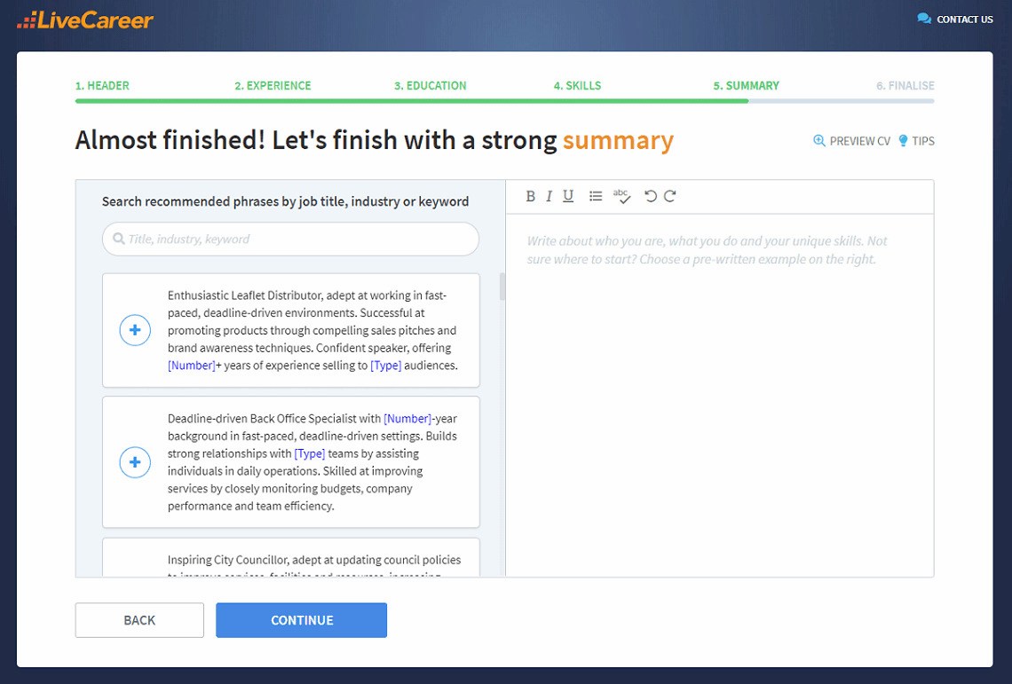
A strong CV summary will convince the recruiter you’re the perfect candidate. Save time and choose a ready-made personal statement written by career experts and adjust it to your needs in the LiveCareer CV builder.
Now you’ve nailed your setup, let’s take a look at the different types of CV format. Such knowledge might be helpful especially if you're writing your first CV. The CV format refers to the way you order your CV sections and what aspects of your professional abilities you emphasise.
In the UK there are two main types of CV structure, chronological and skills-based CV. Let’s take a look at each in turn.
If you ask most people what should a CV look like the image in their head will be of a chronological CV. It’s the best format for the vast majority of candidates, preferred by recruiters and the best way of putting the spotlight on your work experience.
So here’s what a chronological CV should look like, section by section.
CV header
This is the very first part of your CV right at the top of the page and contains your personal details. Include your full name, phone number, email address and social media handles if they’re relevant to the job.
Your postal address isn’t necessary. And for emphasis, you can set the font size for your name 6–8 points larger than your body text.
CV summary
Also known as a CV personal profile, your CV summary introduces you as a candidate.
It should be 3–5 lines long and establish who you are, what you can offer as an employee and what your future career goals are. Add some energy and enthusiasm and you’ve set up the perfect introduction.
Work experience
This is the big one, the single most important part of a chronological CV. Your work experience section should start with your current or most recent employer and work backwards from there. For each role include the name of your employer, your job title and your dates of employment, with ‘present’ as the start date if you still work there.
Then for each role, write 4–6 bullet points describing the job. But don’t just write a list of duties saying you were ‘responsible for x’. Give the bullet points impact by starting them with a CV action word and structuring them with the PAR (problem, action result) formula.
Education
If you have a university education, include your degree, your dates of study and the name of your university. Include an expected graduation date if you’re still studying.
For school-leavers include your A-levels, listing each subject completed and provide the name of your school or college and your dates of study. Again, use an expected graduation date if you’re still studying. GCSEs aren’t necessary unless you’re still at school or have just left.
And for GCSEs you only need to state the number of subjects you studied. But do specifically mention passes in Maths and English as they are often considered a bare minimum achievement.
Additionally, if you’re still studying or have just left school or university, your CV education section can be included before your work experience.
Skills
This section should be a list of abilities that are relevant to the job you’re applying for. It’s best to include a mix of soft skills and hard skill in your CV skills sections.
And remember that some skills are valuable for almost every job, communication skills and computer skills being among the most important.
Additional sections
Technically, you could stop with your CV skills section. But when considering what should a good CV look like, make sure it doesn’t look like everyone else's. That’s where extra sections come in.
They add a sense of individuality and are a great way of highlighting other skills and accomplishments.
Good CVs include a languages section, hobbies and interests, awards and projects. If any of these help demonstrate your employability, then it’s worth adding.
The other type of CV format used in the UK is known as skills-based or functional.
The difference is that it places the focus on your transferable skills rather than your work history. For the vast majority of candidates chronological is the preferred format.
But here’s what a skills-based CV should look like.
The CV header and CV summary remain the same as in chronological format.
Skills summary
This section takes the place of your work history in a standard CV. You need to choose 3–5 broad transferable skills, which you then use as sub-headings.
Then under each subheading you include bullet points with examples and achievements that demonstrate those skills, much like in a normal work experience section.
Work experience
Think of this as a condensed version of what you’d find in a chronological format. Include the same basic information about each role, and if it’s relevant to the job you’re applying for, one or two bullet points.
Education and additional sections remain the same as in a chronological CV.
And that’s it, you now know exactly what a CV should look like to maximise your chances of job-hunting success.
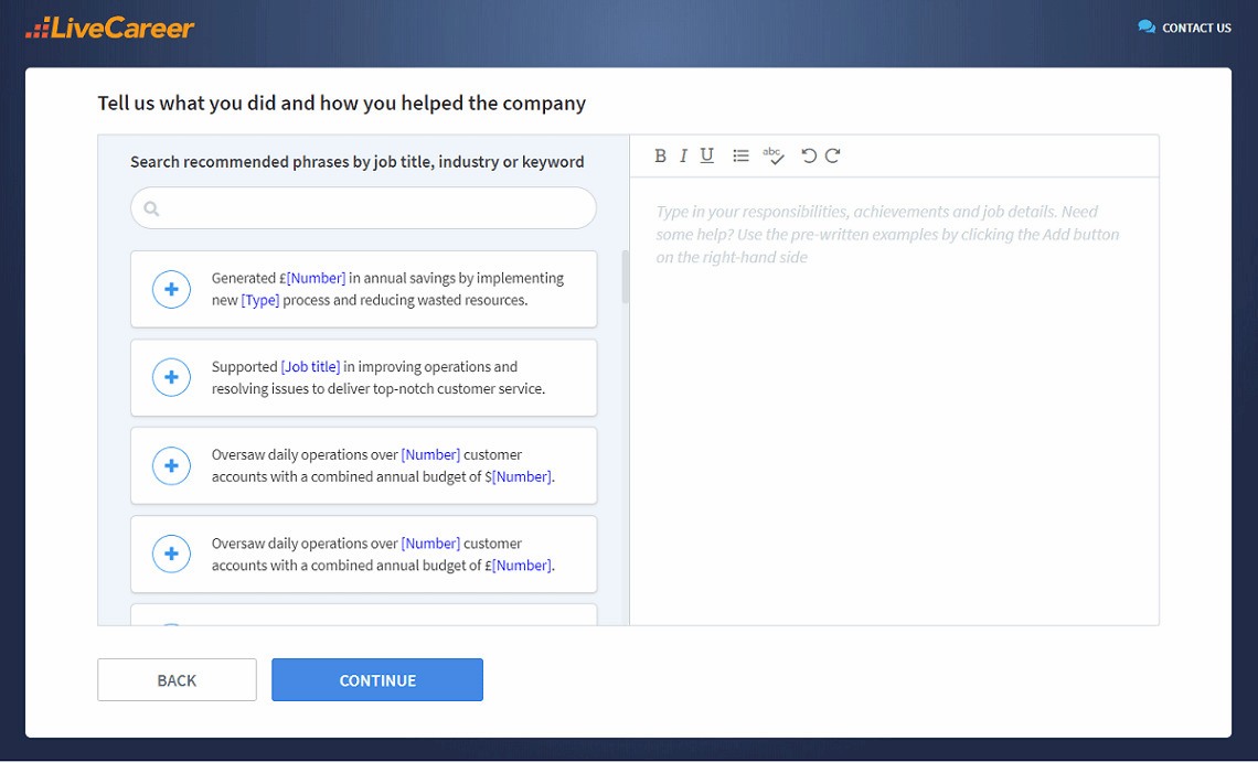
You don’t have to be a CV writing expert. In the LiveCareer CV builder you’ll find ready-made content for every industry and position, which you can then add with a single click.
Thanks for reading, if you’ve got any questions regarding what does a CV look like, please let us know in the comments section. Perhaps you’d like to know more about specific examples, such as what should a graduate CV look like. Whatever your situation we’ll be happy to help.
Our editorial team has reviewed this article for compliance with Livecareer’s editorial guidelines. It’s to ensure that our expert advice and recommendations are consistent across all our career guides and align with current CV and cover letter writing standards and trends. We’re trusted by over 10 million job seekers, supporting them on their way to finding their dream job. Each article is preceded by research and scrutiny to ensure our content responds to current market trends and demand.
About the author
Since 2013, the LiveCareer UK team has shared the best advice to help you advance your career. Experts from our UK editorial team have written more than one hundred guides on how to write the perfect CV or cover letter.
Rate this article:
What should a cv look like
Average:
Whether you're writing a graduate software developer CV, junior software developer CV or senior software developer CV, don't let poor UX let you down!
See great customer service CV examples that’ll help you whether you need to write a CV for customer service assistant jobs or a customer service manager CV.
Discover inspiring CV examples for students and land your dream opportunities. Build a great student CV template that sets you apart from the crowd.
Our customers were hired by: